Home
Monograph
We build logo systems, packaging and typefaces for people who still believe print sets the standard.
Disciplines
Logo systems
Packaging
Posters
Type design
Selected clients
Halver Ferments
Noord & Co
Rijn Atelier
Vantage Press
Recognition
TDC Certificate 2024
D&AD Wood Pencil
European Design Silver
Dutch Design Shortlist
Logo systems
/
Packaging
/
Posters
/
Type design
/
Art direction
/
01 The studio
A press that happens to have a
studio attached
Monograph is six people, two risograph drums and a Heidelberg cylinder that refuses to retire. We treat every identity as a publication: it needs a grid, a hierarchy, a colophon and a reason to exist.
Clients come to us when a brand has to survive being printed on kraft board, kitted on a slow-moving web banner and cut into the side of a delivery van. We draw the mark, cut the die, spec the ink and proof it on the actual stock before anything ships.
02 Logo systems
Marks built to be cut, stamped, embossed and sprayed
Every system ships as a family: primary mark, monogram, horizontal lockup and a one-colour cut that survives a wax stamp. Scroll the plate — each mark draws itself into place.
M
Monograph
House mark
N
Noord & Co
Cold storage
H
Halver
Ferments
R
Rijn Atelier
Furniture
V
Vantage
Press
K
Kade
Koffie
T
Studio Tilt
Architecture
F&F
Fort & Fen
Cidery
03 Projects
Selected spreads, set full bleed
01 Poster and identity
Halver Ferments
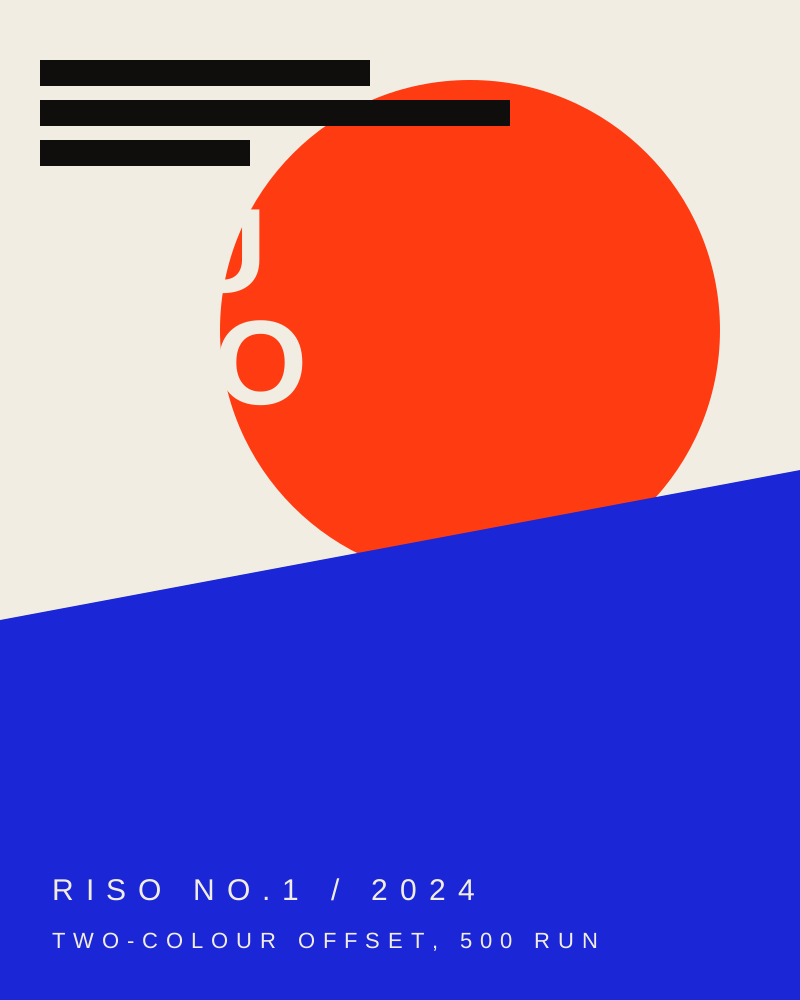
A fermentation house that started in a garage and now supplies forty restaurants. The mark is a six-point asterisk drawn on a squared grid so it can be stamped into wax, cut into crate stencils and printed in two passes without trapping.
The poster series runs on a strict two-ink budget: fluoro orange and reflex blue on 120gsm uncoated. Type is set in Monograph Grotesk at 96pt, no images, no second colour on the interior.
02 Packaging system
Noord & Co
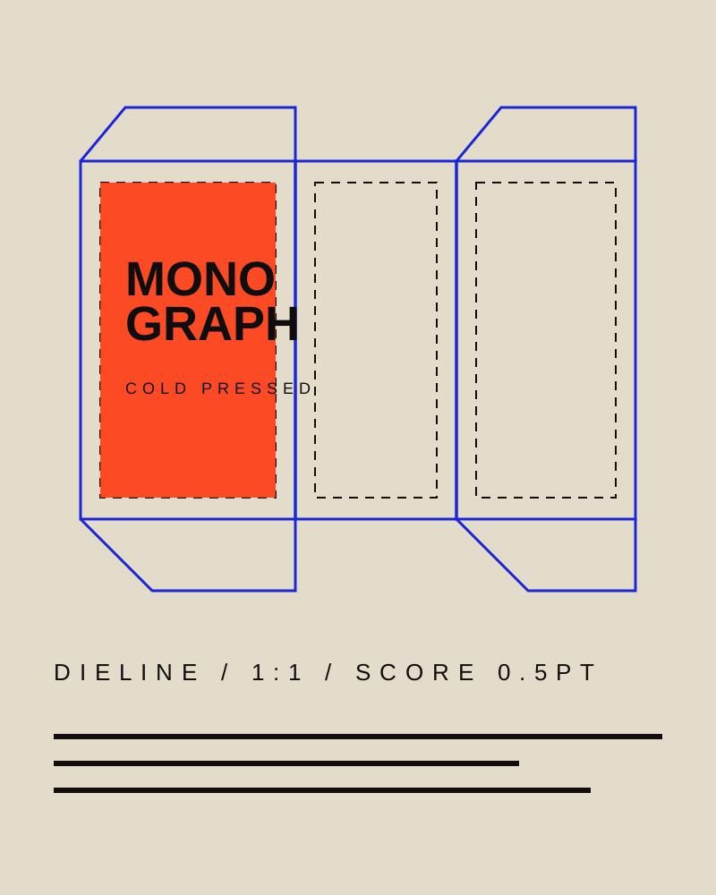
Cold-pressed oils in three sizes, one die, zero glue. The structural brief was to make the carton fold from a single sheet and still show the mark on every face, so the lockup was redrawn to a square proportion that reads at 12mm.
Spec sheets, bottle collars and pallet stencils all inherit the same grid. Nothing closes the box but two friction tabs.
Ink loaded: Fluoro 8010
Drag across the strip to scrub the drums
Press
ink
Wet proof, uncoated 120gsm
04 Colour
Five inks, one press, no fourth colour
We specify every job in inks we can actually mix in the studio. If a colour cannot be laid down in two passes on our cylinder, it does not go in the style guide. Scrub the film strip above to load a drum and see it wet on the sheet.
05 Type specimens
Three families, drawn in-house since 2016
Grab the letterform and throw it. The type is licensed to studios, publishers and packaging teams — specimen PDFs are free to download and print at A4.
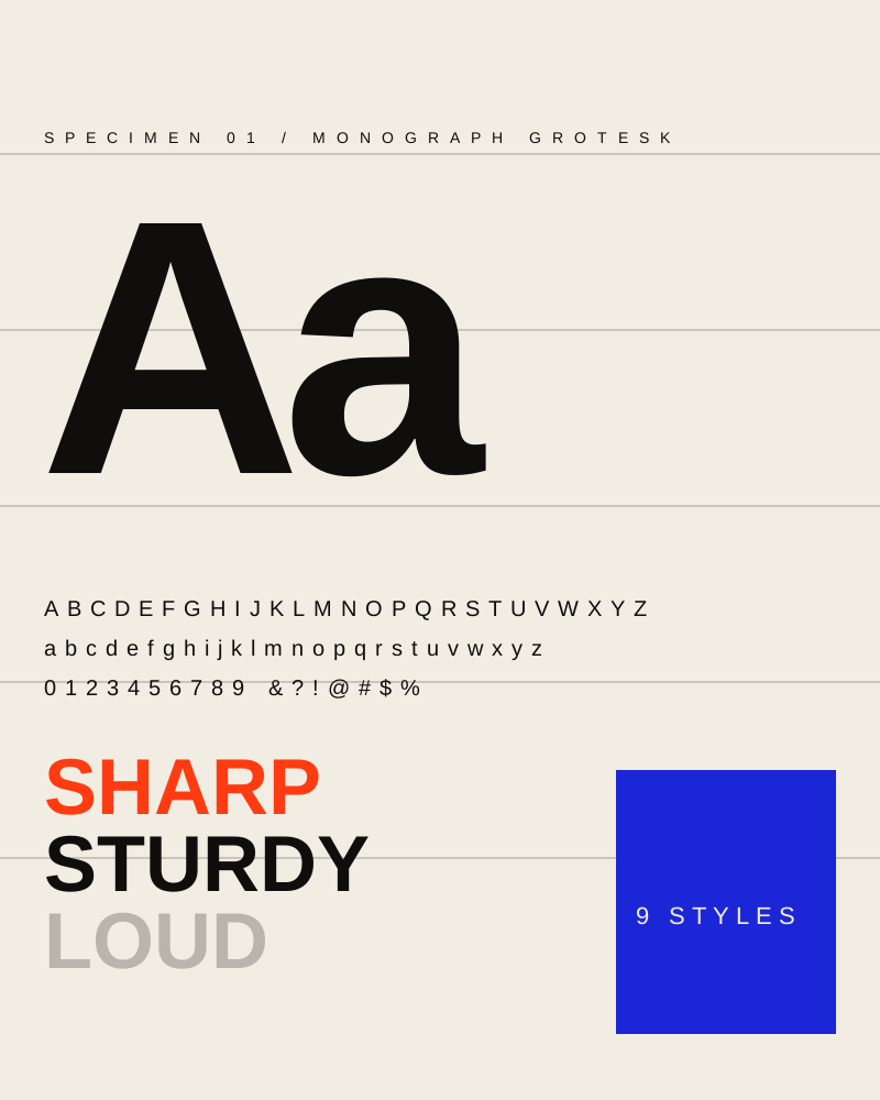
Aa
Specimen 01 — display family
Monograph Grotesk
A fat grotesque with flat terminals and a tight fit, drawn for posters, packaging fronts and anything that has to shout across a room. Nine styles, 640 glyphs, tabular and lining figures as standard.
PDF / A4 / 1.2 MB / Version 3.2 — updated March 2026
Commission brief
Two commission slots open for Q2
Send us the brief, the deadline and the stock you are printing on. We answer within two working days with a scope, a fee and a press date.